- Canon Community
- Discussions & Help
- Printer
- Professional Photo Printers
- Re: Pixma Pro 100s dull colours
- Subscribe to RSS Feed
- Mark Topic as New
- Mark Topic as Read
- Float this Topic for Current User
- Bookmark
- Subscribe
- Mute
- Printer Friendly Page
Pixma Pro 100s dull colours
- Mark as New
- Bookmark
- Subscribe
- Mute
- Subscribe to RSS Feed
- Permalink
- Report Inappropriate Content
11-08-2019 09:22 AM
Hello
Will I ever be able to get vibrant colours from a Pixma Pro 100s?
I have tried everything I can think of, i have tried countless ICC profiles, software packages and other suggestions on the internet but nothing works.
I make a lot of prints of my own art and decided to start printing myself instead of outsourcing and the 100s seemed a good choice from internet feedback. But I'm very much regretting it at this stage and feels like a waste of money if it cannot match vibrant colours. Even regular colours seem a bit on the dull side.
Anyone else with a 100s care to attempt to try and replicate vibrant colours with similar tests?
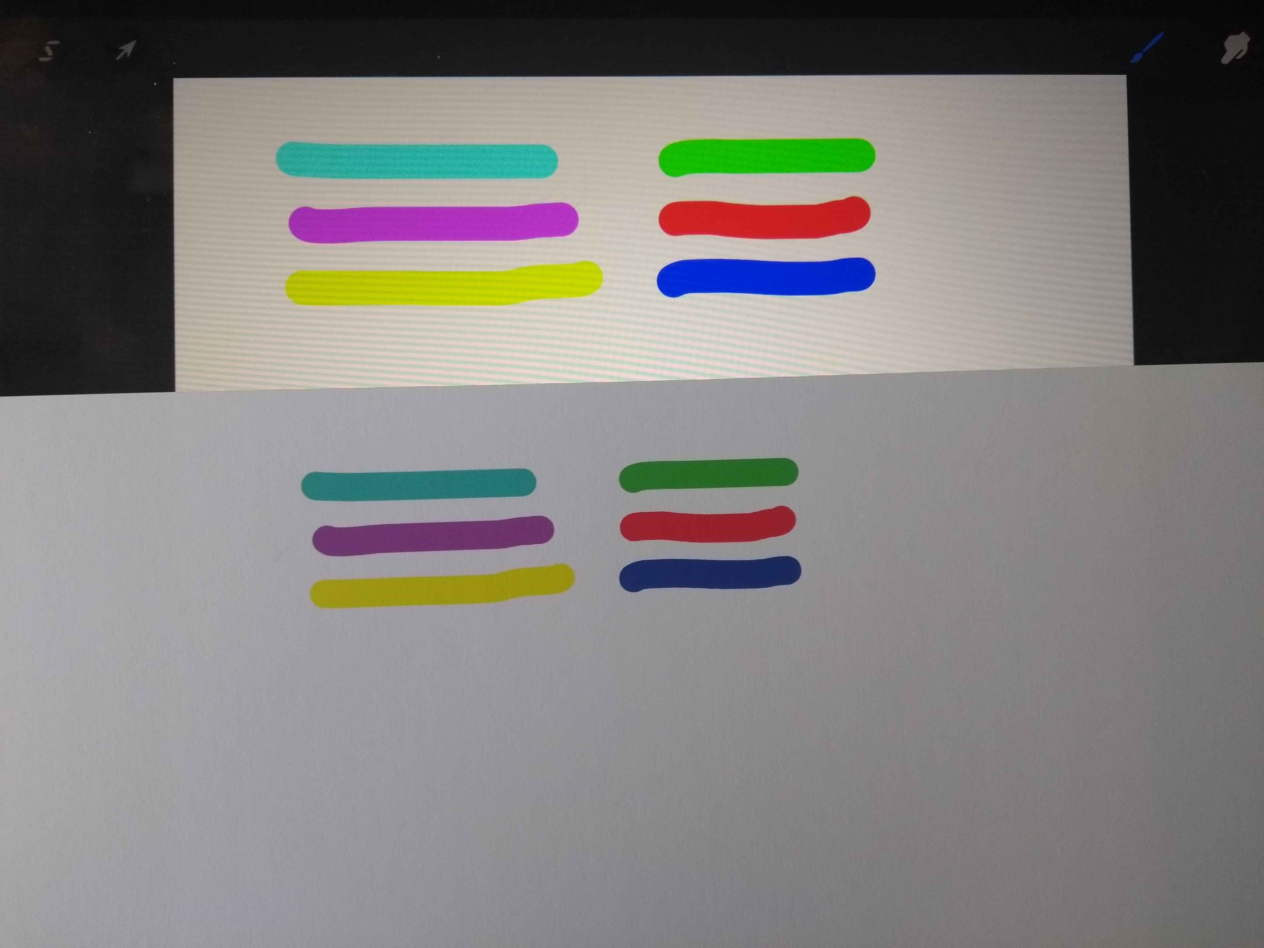
i know a backlit screen and tablets and monitors helps, but the printer isn't even coming close. This is probably my best attemp ttout of many.
is it even possible to get a true cyan/magenta/etc colour?
- Mark as New
- Bookmark
- Subscribe
- Mute
- Subscribe to RSS Feed
- Permalink
- Report Inappropriate Content
11-08-2019 12:26 PM - edited 11-08-2019 12:29 PM
Welcome to the forum Kwyjibo. We will need more info in order to try an assist.
In general, the answer to your question is yes. With the appropriate paper and printer settings you will get accurate colors with the Pro-100. Canon Photo Paper Pro Platinum is tops for bright colors - like the Cibachrome prints back in wet darkroom days.
What paper are you using?
Is there a recommended ICC profile and media type for that paper (if its not Canon paper).
What is your operating system?
What software are you printing from ?
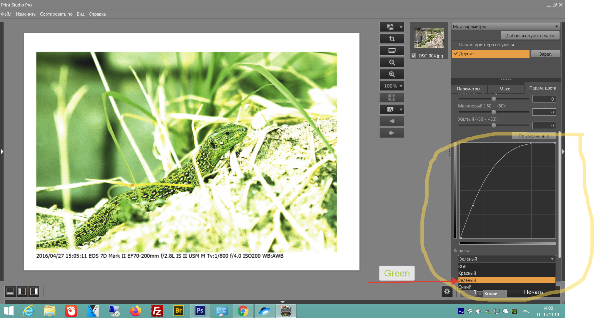
Can you post a screenshot of your software print module settings?
Have you calibrated your monitor, espescially brightness?
Download this test image and print it from your software - do not make any brightness or color adjustments to the on screen image. Jiust open it and print - preferably on Canon paper.
http://www.outbackphoto.com/printinginsights/pi049/essay.html
Conway, NH
R6 Mark III, M200 (converted to infrared), RF lenses, Pixma PRO-100, Pixma TR8620a, Lr Classic
- Mark as New
- Bookmark
- Subscribe
- Mute
- Subscribe to RSS Feed
- Permalink
- Report Inappropriate Content
11-08-2019 01:34 PM
I’m using a combination of Canon pro platinum and run of the mill matte photo paper. There are no big differences between the 2 really.
I’ve used the canon ICC and others for the canon paper and all kinds for the matte.
I’m printing on a combination of Win10 and IOS on iPad.
I’ve tried using ProCreate and the Canon printer app on iPad
Photoshop and lightroom on Win10
I’m getting very very slightly better results on photoshop, colours are a bit bolder but still not at all light and vibrant that I want.
I’m allowing photoshop to choose colours over the printer and force disabled any options that the printer may interfere with photoshop colour management.
I haven’t calibrated my screen but I’m testing using the CMYK values on the prints so should be seeing those colours on the print ......right?
I will do that test print. Thank you.
- Mark as New
- Bookmark
- Subscribe
- Mute
- Subscribe to RSS Feed
- Permalink
- Report Inappropriate Content
11-08-2019 02:30 PM
"I haven’t calibrated my screen but I’m testing using the CMYK values on the prints so should be seeing those colours on the print ......right?"
What can happen is that if your monitor is too bright you would adjust exposure in the photo app to look right on screen. Then when you print it could be too dark.
That's the test print is for. It is calibrated to produce a good print. When you print it it should should look "right" in standrard viewing conditions. Then compare it to how the image looks on screen.
There is another option we can discuss after you run the test print.
Conway, NH
R6 Mark III, M200 (converted to infrared), RF lenses, Pixma PRO-100, Pixma TR8620a, Lr Classic
- Mark as New
- Bookmark
- Subscribe
- Mute
- Subscribe to RSS Feed
- Permalink
- Report Inappropriate Content
11-10-2019 09:45 PM
I have the same issue with the Canon Pro-1000. There are certain bright greens that I cannot hit, and it isn't just with one paper, it is with many papers. I have paid to have profiles made for certain papers, both photo papers and matte papers, and I have tried many profiles from Hahnemuhle and Canson.
I print for a living. It is my business, and I bought a Canon Pro-1000 to test the waters and see if I could move away from Epson printers. Sadly it is my conclusion that there are certain bright greens that I will never be able to attain. And I say this after spending countless hours testing every possible setting, and many many paper types, and doing the same using the same image, over and over again, also on an Epson P-5000, P-9000, and Epson 9900. I have also paid to have profiles made for those printers, as well as using profiles from Canson, Hahnemuhle, Lexjet, Breathing Color and others.
It is my conclusion that since Canon has removed the green ink in its latest printers, that there are bright greens that are unattainable on any of the new Canon printers that do not contain green ink - where Canon has replaced the green ink with the Chromo Optimizer.
I would love for someone to prove me wrong and I'm even working on a video about it to help others, but it is my professional opinion that there are indeed bright greens that are just unattainable with the new Canon printers. I have a 18x24 portfolio book with identical test prints from the Epson 9900, P5000, and Canon Pro-1000, and under no circumstances have I been able to get color parity between the Canon Pro-1000 and the Epson printers. I've spent a good 80 hours on this project, and have not found a solution. The closer you get to RGB 0,255,0, the more you see that it can't be printed.
I can post pictures if you would like. But I am seeing exactly what you are with the greens.
Papers I have used (I have had companies that specialize in making ICC profiles make custom profiles for all of these, and/or I have used profiles from the paper manufacturer. In some cases I have tried two or three ICC profiles):
Epson Enhanced Matte
Epson Semi-Matte
Epson proofing Semi-Matte
Lexjet Semi-Matte
Lexjet Premium Archival Matte
Lexjet Premium Sunset Select Canvas
Canson Aquarelle Textured Rag (Arches)
Canson Velin Rag
Hahnemuhle Photo Rag Bright White
Hahnemuhle Photo Rag Satin
Hahnemuhle Fine Art Baryta
Hahnemuhle William Turner Rag
Hahnemuhle German Etching Rag
Hahnemuhle Museum Etching Rag
Hahnemuhle Torchon
Canon Luster
Canon Matte Photo
Canon Gloss Photo
Breathing Color Lyve Canvas
- Mark as New
- Bookmark
- Subscribe
- Mute
- Subscribe to RSS Feed
- Permalink
- Report Inappropriate Content
11-10-2019 09:49 PM
Note: I have not had issues with the Cyan or Yellow, or any other color. The yellow is briliant, as is the red, and in all cases when I print with the correct media type, the colors are brilliant.
It's also worth noting that the issue with green is limited, but it is there. I have an X-right SG color chart that I use in creating camera profiles, and I have a digital copy that has had each color patch adjusted to be the exact RGB value of the physical chart that shows very limited color differences and in most cases very good color. It's just that bright green that eludes me.
- Mark as New
- Bookmark
- Subscribe
- Mute
- Subscribe to RSS Feed
- Permalink
- Report Inappropriate Content
11-13-2019 01:34 AM
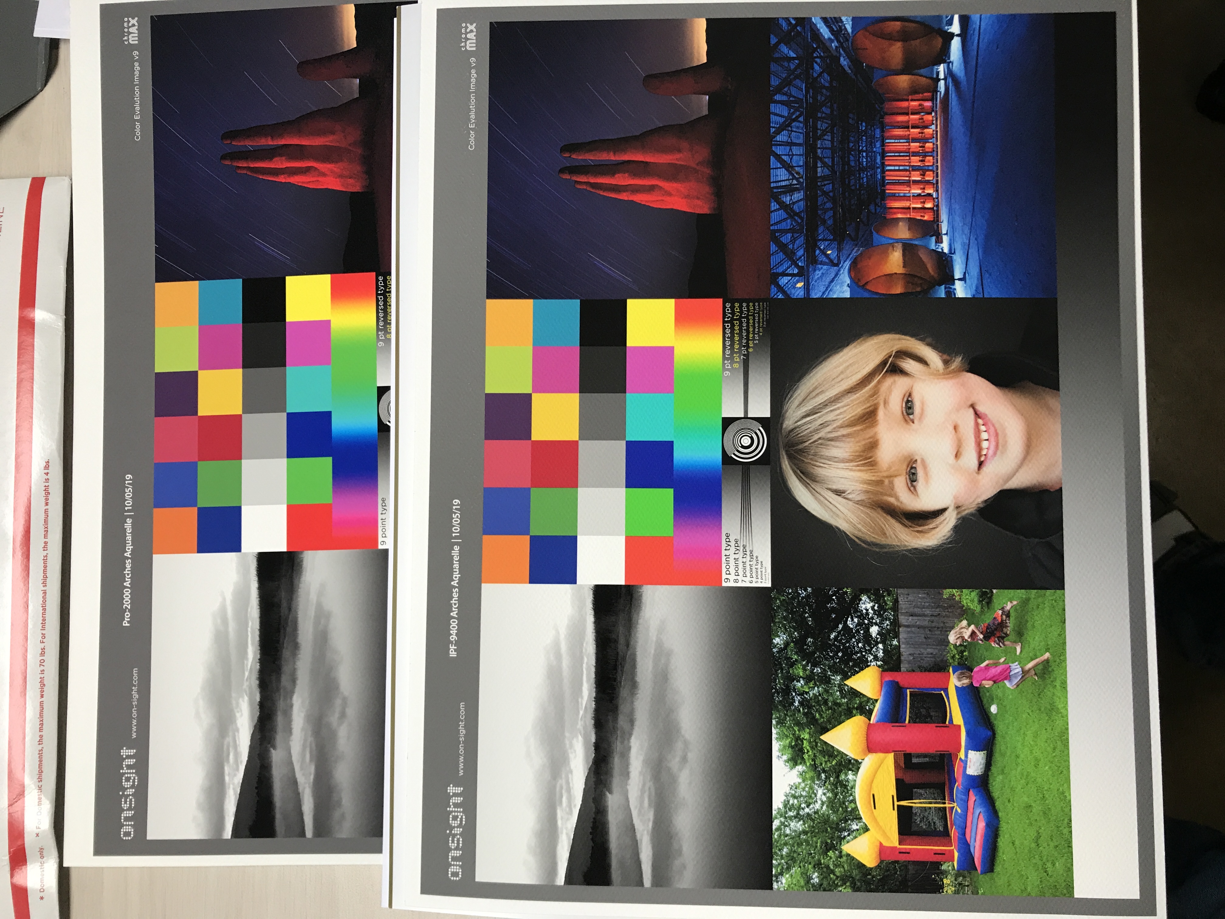
I work with another printer in the area that is all Canon. He recently bought a Pro-2000 24", and I asked him about the green because he also has animagePROGRAF iPF8400 andimagePROGRAF iPF9400 with green ink. We compared a stack of test prints he did after having profiles made, and sure enough, it looks just like the Pro-1000 - the green ink is weak and dull, but the greens on his olderimagePROGRAF iPF8400 and imagePROGRAF iPF9400 were bright and showed better color.
The newer Canon printers that replaced green ink with the Chroma Optimizer show weak greens. Bright green appears to simply be out of gamut and impossible to hit. For me anyway it's a serious issue
- Mark as New
- Bookmark
- Subscribe
- Mute
- Subscribe to RSS Feed
- Permalink
- Report Inappropriate Content
11-15-2019 06:02 AM - edited 11-15-2019 06:08 AM
The best green transfer paper is matte photo paper. Canon website has profiles for art papers, keep this in mind and it’s better to print with original cartridges.
- Mark as New
- Bookmark
- Subscribe
- Mute
- Subscribe to RSS Feed
- Permalink
- Report Inappropriate Content
11-15-2019 12:41 PM
I don’t need transfer papers. Again, I’ve tested this with many papers on the pro-1000 with custom profiles and the canon pro 1000 cannot hit certain bright greens, period. Since my first post I’ve also verified this on a canon pro-2000 (same ink set) with many papers, and the bright green is out of gamut. Period.
Look at the difference between an older iPf-9400 and the new pro-2000. I think it was a huge mistake for canon to remove the green ink. The bright greens are dull.
I would love love for someone to prove me wrong, but please do it with a concrete example and Repro steps, not a supposition or “probably” type statement. Thanks.
- Mark as New
- Bookmark
- Subscribe
- Mute
- Subscribe to RSS Feed
- Permalink
- Report Inappropriate Content
11-30-2019 12:04 PM
03/17/2026: New firmware updates are available.
SELPHY CP1500 - Version 1.0.7.0
02/23/2026: New firmware update is available for EOS C50- Version 1.0.3.1
01/23/2026: New firmware update is available for RF 24-105mm F4 IS USM- Version 2.0.7
01/20/2026: New firmware updates are available.
12/22/2025: New firmware update is available for EOS R6 Mark III- Version 1.0.2
11/20/2025: New firmware updates are available.
EOS R5 Mark II - Version 1.2.0
PowerShot G7 X Mark III - Version 1.4.0
PowerShot SX740 HS - Version 1.0.2
10/21/2025: Service Notice: To Users of the Compact Digital Camera PowerShot V1
10/15/2025: New firmware updates are available.
Speedlite EL-5 - Version 1.2.0
Speedlite EL-1 - Version 1.1.0
Speedlite Transmitter ST-E10 - Version 1.2.0
07/28/2025: Notice of Free Repair Service for the Mirrorless Camera EOS R50 (Black)
7/17/2025: New firmware updates are available.
05/21/2025: New firmware update available for EOS C500 Mark II - Version 1.1.5.1
- PIXMA iX6850 Photos printing darker in Desktop Inkjet Printers
- PIXMA G3590 Disappointed with colour quality in Desktop Inkjet Printers
- PIXMA TR4722 Colours missing from Windows printer test page in Desktop Inkjet Printers
- Canon Pixma Pro 200 - Reset ink levels once non-genuine ink has been used in Professional Photo Printers
- Media Options not available on Mac for PIXMA G6020 in Printer Software & Networking
Canon U.S.A Inc. All Rights Reserved. Reproduction in whole or part without permission is prohibited.


