- Canon Community
- Discussions & Help
- Printer
- Professional Photo Printers
- PRO 10 colors completely off
- Subscribe to RSS Feed
- Mark Topic as New
- Mark Topic as Read
- Float this Topic for Current User
- Bookmark
- Subscribe
- Mute
- Printer Friendly Page
- Mark as New
- Bookmark
- Subscribe
- Mute
- Subscribe to RSS Feed
- Permalink
- Report Inappropriate Content
02-29-2020 04:45 PM
First, I am printing from a Mac, OS 10.15.3, and printing my image from IPhoto and Preview. I haven't used my Pro-10 in a while, so I made sure the driver was current and all the ink tanks were full. I put Canon photo paper in the printer and matched the type to the type in the dialog box. All systems go. However, when my print came out, a rich blue navy blue blazer was a murky purple, not even close to navy. Black wrought iron rails were also purple. I printed the same file on a Brother printer, and the color was fairly accurate, although the detail not quite as good. How can I get the color to match the screen on my Canon Pro 10?
Solved! Go to Solution.
- Mark as New
- Bookmark
- Subscribe
- Mute
- Subscribe to RSS Feed
- Permalink
- Report Inappropriate Content
03-06-2020 10:48 PM
Okay my problem appears to be solved - maybe. As you suggested the issue might have been a conflict between the printer and the Lightroom software. In the Canon Pro-10 series Properties dialog box I knew you needed to have everything off but I have been unable to figure out exactly how you do that (hey Canon would it really be that hard to have an off switch???). Through trial and error I found that under Quick Setup I need to have all of the "additional features" unchecked. Next under the main tab I have Print Quality as "high" (that may not be necessary) and Color Intensity at auto. Once I did that I was finally able to reproduce the full red in the strawberry on the test print. I will see if this solution works throughout my own pictures.
- Mark as New
- Bookmark
- Subscribe
- Mute
- Subscribe to RSS Feed
- Permalink
- Report Inappropriate Content
03-07-2020 08:17 AM - edited 03-07-2020 08:34 AM
Hi dplaz1.
There are two options - printer manages color or application (in your case Lr) manages color.
For Lr manages, you select an ICC profile in Lr and turn off color management in the printer driver. See below:
For printer manages you select that in Lr and set up printer as shown below if you are using Canon paper. The printer automatically selects the appropriate ICC profile for the chosen paper.:
Or you can do this:
Here you are choosing the ICC profile in the printer driver. You can do this for canon papers or third-party papers.
Conway, NH
R6 Mark III, M200 (converted to infrared), RF lenses, Pixma PRO-100, Pixma TR8620a, Lr Classic
- Mark as New
- Bookmark
- Subscribe
- Mute
- Subscribe to RSS Feed
- Permalink
- Report Inappropriate Content
03-07-2020 09:38 AM
I appreciat the comment but as you may note from the conversation above I tried all of that and it had no impact on the print. Only by doing what I describe in my last note was I able to get colors (primarily red) to match the test image.
- Mark as New
- Bookmark
- Subscribe
- Mute
- Subscribe to RSS Feed
- Permalink
- Report Inappropriate Content
03-07-2020 09:43 AM
Let's think this through. When I chose Lightroom managed but Auto in the Canon dialog you would think there should be a conflict but that is the only combination where I get the correct colors.
Lightroom managed and None in the Canon dialog box gives bad results.
I have to be making some basic mistake somewhere.
- Mark as New
- Bookmark
- Subscribe
- Mute
- Subscribe to RSS Feed
- Permalink
- Report Inappropriate Content
03-07-2020 09:54 AM - edited 03-07-2020 10:03 AM
I don't like to say folks are making an error from a distance, but I do know that the settings I posted work properly.
Verify:
1. proper media type selected in the printer driver
2. corresponding ICC profile selected in Lightroom
3. Matching->None selected in driver
Or
1. printer manages color in Lightroom
2. proper media type selected in driver
3. Auto selected in driver
If neither of these give proper prints then you should call Canon at 1-800-OK-CANON so you can talk directlty to someone.
Conway, NH
R6 Mark III, M200 (converted to infrared), RF lenses, Pixma PRO-100, Pixma TR8620a, Lr Classic
- Mark as New
- Bookmark
- Subscribe
- Mute
- Subscribe to RSS Feed
- Permalink
- Report Inappropriate Content
03-07-2020 04:58 PM
Yes all, doesn't work.
Thanks
- Mark as New
- Bookmark
- Subscribe
- Mute
- Subscribe to RSS Feed
- Permalink
- Report Inappropriate Content
03-07-2020 05:39 PM
Conway, NH
R6 Mark III, M200 (converted to infrared), RF lenses, Pixma PRO-100, Pixma TR8620a, Lr Classic
- Mark as New
- Bookmark
- Subscribe
- Mute
- Subscribe to RSS Feed
- Permalink
- Report Inappropriate Content
03-08-2020 08:11 AM
yes
- Mark as New
- Bookmark
- Subscribe
- Mute
- Subscribe to RSS Feed
- Permalink
- Report Inappropriate Content
01-17-2021 01:20 PM
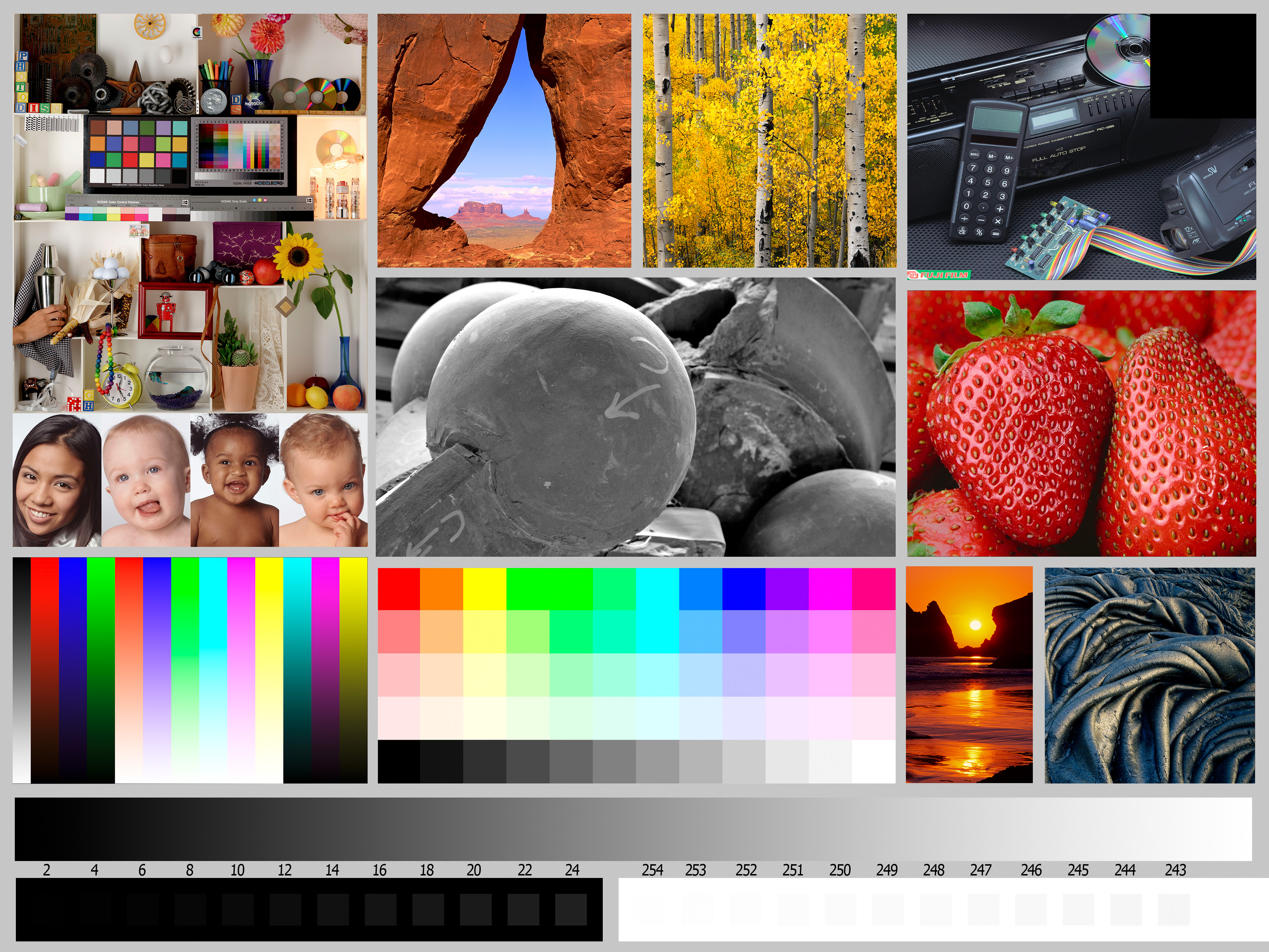
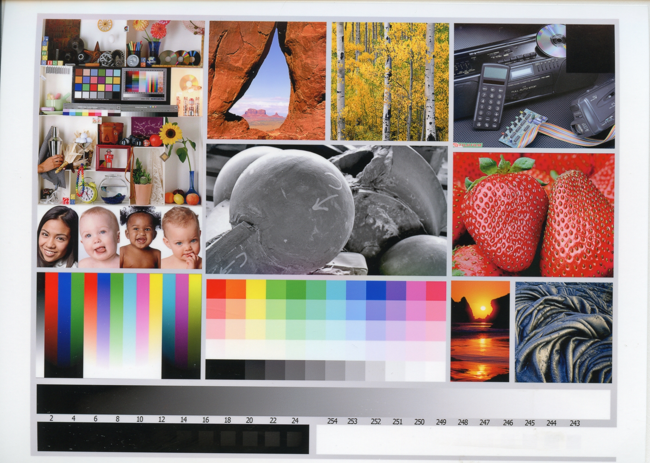
John, this is a continuation of a conversation we had last year which I have never resolved. I did something yesterday that was interesting. I have attached a standard sample picture I downloaded and then a copy I printed which I then scanned. Here is the mystery . Allowing for a lack of "brightness" due to the quality of my scan the colors look pretty close. That is not the case when I am comparing the print to the screen. In other words when the print is placed (scanned) to the screen they look the same. I understand duplicating the screen may not be %100 possible but maybe this is a screen issue. When I calebrate there are two options, one says photography and the other printing. Brightness goes from 100 cd/m2 (I don't know what that means) to 80 cd/m2 and White point goes from 5500 to 5000. Am I creating unrealistic conditions on my screen that can't be duplicated in the print? I would be imterested in your thoughts.
- Mark as New
- Bookmark
- Subscribe
- Mute
- Subscribe to RSS Feed
- Permalink
- Report Inappropriate Content
01-17-2021 02:30 PM
Hi.
Those two parameters (brightness and white point) are two areas that get a lot of discussion and recommendations.
cd/m2 is a unit of brightness measurement (candelas per square meter). Lower is dimmer/higher is brighter. The proper value depends heavily on the lighting conditions in the room where you are editing your images.
A common complaint from folks is "my prints are too dark". That is typically because their screen is too bright and when they edit they reduce the exposure. That is why the instructions for the Outbackphoto test image says to just print - do not make any adjustments. The file is correctly adjusted to give a proper print. One thing to verify is that your photo editing software isn't applying any initial adjustments; you want to be sure the test image is being printed "as is".
In your situation which print (80 or 100) is closest to the monitor brightness? That's the setting you would want to use so that when you edit your own prints they come as close as possible to your monitor.
White point setting it is influenced by the viewing conditions of the print. The "industry standard" viewing lighting for professional settings is, from what I have read, around 5000K. So if one is printing for exhibition they would set their monitor to 5000K.
For general use in a home the lighting conditions are closer to 6500K. Here is a little document by Xrite.
Monitor Calibration - Which White Point is Correct? (xrite.com)
Some feel 6500K is too blue. I have followed the recommendation to set my white point at 5800K since photo paper tends to be warmer than 6500K.
In the end, 1. you are correct, the print, being frontlighted will never look exactly the same as the monitor, which is backlighted. 2. the proper settings are the ones that give a good match when you print a standardized test image. That way you can have confidence that the print output of one of your own images will match the screen.
After a lot of evaluating I have standardized on 80 cd/m2 and 5800K for my calibration settings. That gives me a good match between screen and print. I'm only showing my prints in my home, not a gallery. I also have low background lighting when I edit to be sure that there is no light falling on my monitor screen.
Conway, NH
R6 Mark III, M200 (converted to infrared), RF lenses, Pixma PRO-100, Pixma TR8620a, Lr Classic
- « Previous
- Next »
- « Previous
- Next »
05/13/2026: New firmware updates are available.
EOS R5 Mark II - Version 1.3.0
EOS R6 Mark II - Version 1.7.0
04/28/2026: Service Notice: Caution Concerning use of Lithium Batteries
03/17/2026: New firmware updates are available.
SELPHY CP1500 - Version 1.0.7.0
02/23/2026: New firmware update is available for EOS C50- Version 1.0.3.1
01/23/2026: New firmware update is available for RF 24-105mm F4 IS USM- Version 2.0.7
01/20/2026: New firmware updates are available.
12/22/2025: New firmware update is available for EOS R6 Mark III- Version 1.0.2
10/21/2025: Service Notice: To Users of the Compact Digital Camera PowerShot V1
10/15/2025: New firmware updates are available.
Speedlite EL-5 - Version 1.2.0
Speedlite EL-1 - Version 1.1.0
Speedlite Transmitter ST-E10 - Version 1.2.0
07/28/2025: Notice of Free Repair Service for the Mirrorless Camera EOS R50 (Black)
05/21/2025: New firmware update available for EOS C500 Mark II - Version 1.1.5.1
- PIXMA TR7500 Series: Prints about 90% and then freezes in Desktop Inkjet Printers
- MF753Cdw - Blurry Color Printing and Printer Color and Image Adjustment Functions Not Working in Office Printers
- mf644cdw only printing in gray scale not able to change to color printing in Office Printers
- Color imageCLASS LBP632Cdw: offset short edge/long edge not responsive in Office Printers
- imageCLASS MF643Cdw - Duplex Option Missing on macOS Tahoe in Printer Software & Networking
Canon U.S.A Inc. All Rights Reserved. Reproduction in whole or part without permission is prohibited.


