- Canon Community
- Discussions & Help
- Printer
- Professional Photo Printers
- PIXMA PRO-100 prints too dark, especially greens
- Subscribe to RSS Feed
- Mark Topic as New
- Mark Topic as Read
- Float this Topic for Current User
- Bookmark
- Subscribe
- Mute
- Printer Friendly Page
PIXMA PRO-100 prints too dark, especially greens
- Mark as New
- Bookmark
- Subscribe
- Mute
- Subscribe to RSS Feed
- Permalink
- Report Inappropriate Content
10-23-2019 04:41 PM
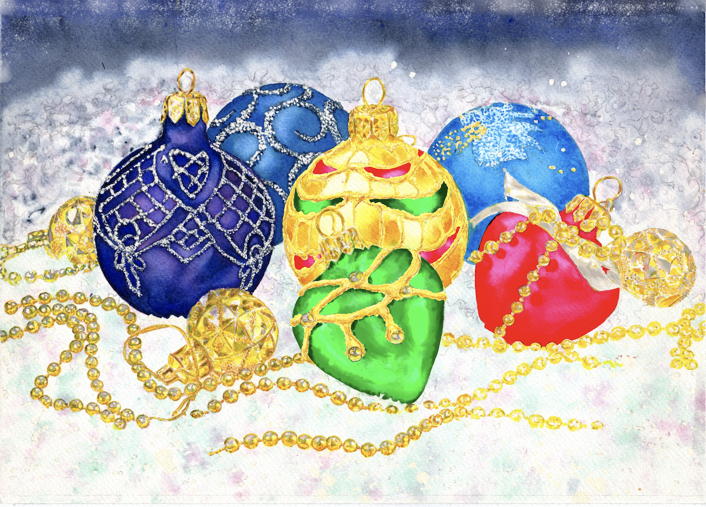
I have a digital file for Xmas balls that shines with color reflections in gold, green and red. When I print on high end textured watercolor paper for inkjet all of the green and red flattens out into a rich but dull looking red and green, no reflection or lighter areas. Attached is the original screen shot and a scan of the print to compare. Can anybody help me here? I have done everything right working it all out with Canon tech support, but the problem persists. It's as if it wants it to be a Black and White photograph. What am I doing wrong? (screenshot and print scanned below)
- Mark as New
- Bookmark
- Subscribe
- Mute
- Subscribe to RSS Feed
- Permalink
- Report Inappropriate Content
10-23-2019 10:47 PM
What paper type are you selecting when you print?
What software? What operating system?
Conway, NH
R6 Mark III, M200 (converted to infrared), RF lenses, Pixma PRO-100, Pixma TR8620a, Lr Classic
- Mark as New
- Bookmark
- Subscribe
- Mute
- Subscribe to RSS Feed
- Permalink
- Report Inappropriate Content
10-28-2019 02:37 PM
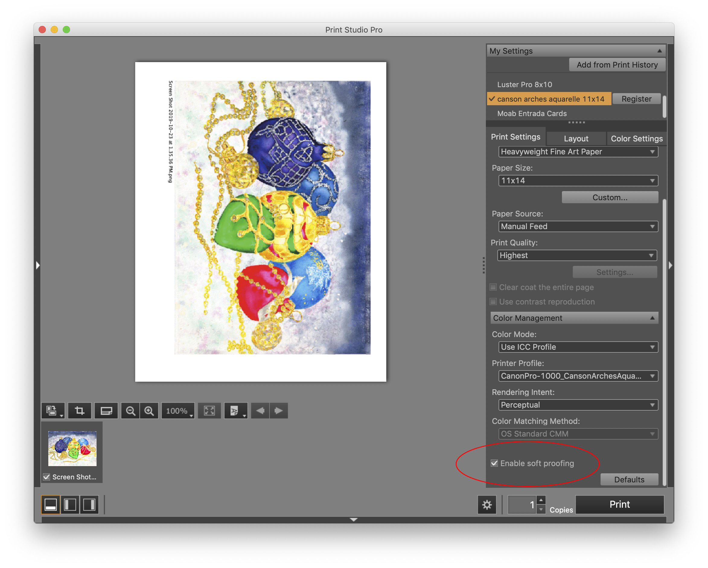
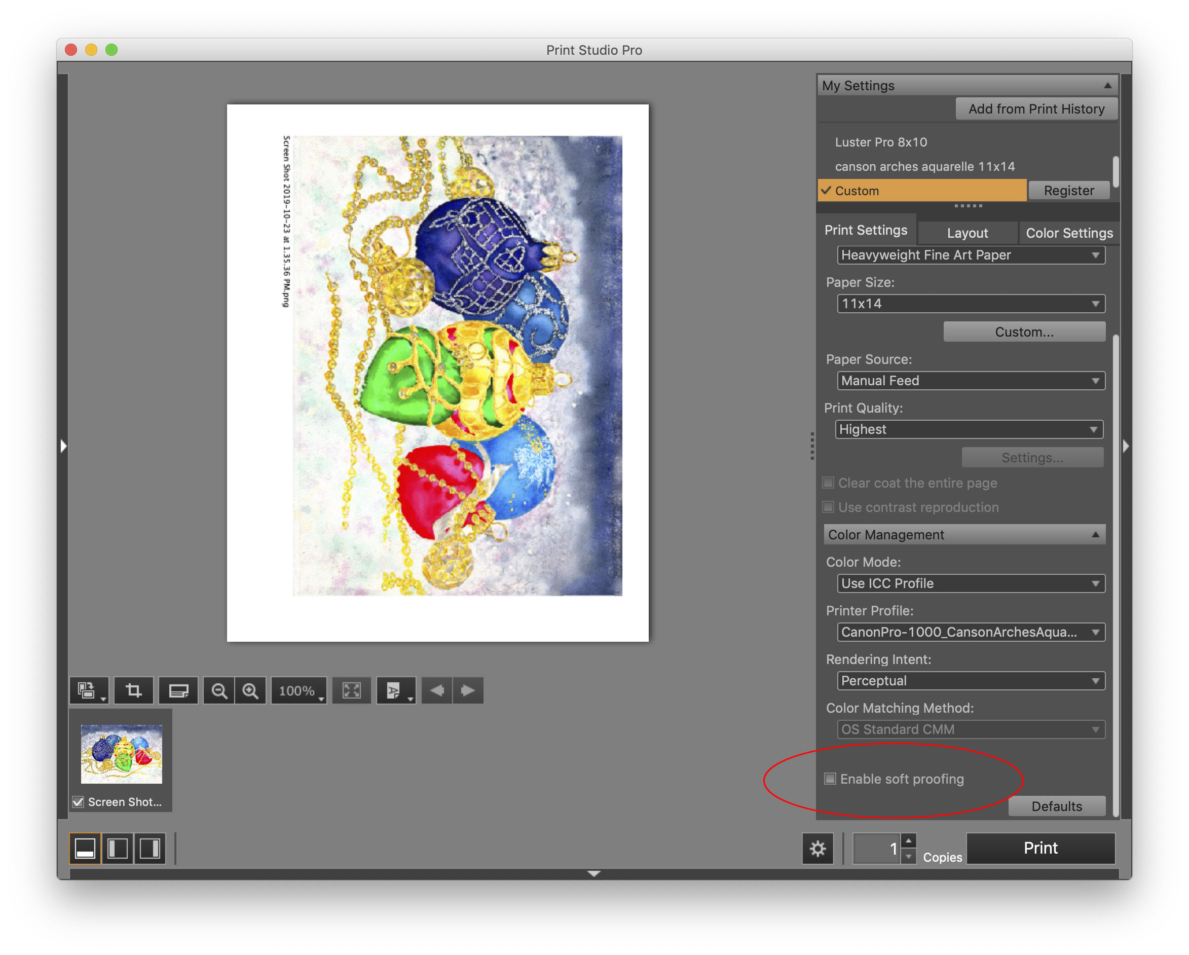
It could be that the correct ICC profile isn't applied, OR the correct media type. If you're using Canon Print Studio Pro, the soft proofing is actually helpful in seeing what you might expect if printed, even if it's not perfect. It could also be that the green you want is out of gamut for that paper.
- Mark as New
- Bookmark
- Subscribe
- Mute
- Subscribe to RSS Feed
- Permalink
- Report Inappropriate Content
10-28-2019 02:51 PM
- Mark as New
- Bookmark
- Subscribe
- Mute
- Subscribe to RSS Feed
- Permalink
- Report Inappropriate Content
10-28-2019 02:58 PM
With the Hahnemuhle William Turner you will want the media type to be High Density Fine Art. It makes a huge difference with that paper, but if you use the William turner profle from Hahnemuhle and that paper type, you should be able to hit that green. I just profiled my Canon Pro-1000 and the William Turner last week, and the greens are stronger than some of the other textured fine art papers I use.
- Mark as New
- Bookmark
- Subscribe
- Mute
- Subscribe to RSS Feed
- Permalink
- Report Inappropriate Content
10-28-2019 05:29 PM
@Noirgalant wrote:
I use Hahnemuehe textured watercolor paper ‘Turner’ with the correct ICC profile downloaded from manufacturer on an iMac running the new Catalina OS& have tried both the Canon Print Studio Pro and the Affinity Photo the latter working better because apparently Canon has not chosen yo update yet for the newest Apple OS. I redid the green with a different hue of green, similar flattened out results. Apparently Retina display brilliance does not translate to this printer which uses too many greytones, great for photographs but not for brilliant art graphics.
Canon does have an updated driver for Catalina. You most likely know this, but when you add the printer after updating be sure it is the IJ Series version and not AirPrint.
Conway, NH
R6 Mark III, M200 (converted to infrared), RF lenses, Pixma PRO-100, Pixma TR8620a, Lr Classic
- Mark as New
- Bookmark
- Subscribe
- Mute
- Subscribe to RSS Feed
- Permalink
- Report Inappropriate Content
10-29-2019 10:36 AM
I don't have problems with saturation, but with too much dark values. I am looking for bright. Since there is no white ink brighter must be created by lower saturation and less black. That is how it works in analog watercolors, and also on the retina/4K screen. The pirnter ignores that for some reason, especially with the greens. Please look at my original screen shot and scan of the resulting print.
- Mark as New
- Bookmark
- Subscribe
- Mute
- Subscribe to RSS Feed
- Permalink
- Report Inappropriate Content
10-29-2019 11:28 AM - edited 10-29-2019 12:10 PM
Since you are using Print Studio Pro you can print a test pattern that will vary colors as well as a test pattern that will vary brightness.
First you could run a pattern print to see what combination of brightness and contrast gives you the most pleasing overall image:
Then you could run a color test pattern to see any color tweaks are necessary/desired:
Then you can input your adjustmenst into the Canon printer driver:
Finally, you can save preset in the driver that can recalled whenever you want:
You can also do similar settings in PSP but I prefer to print from Lightroom since PSP doesn't provide an output sharpening feature like LR does.
Conway, NH
R6 Mark III, M200 (converted to infrared), RF lenses, Pixma PRO-100, Pixma TR8620a, Lr Classic
- Mark as New
- Bookmark
- Subscribe
- Mute
- Subscribe to RSS Feed
- Permalink
- Report Inappropriate Content
10-29-2019 01:23 PM
John, That's very helpful. How did you get to the last part where you configure the printer? The XPS properties page? That could be very helpful for me in getting the colors right for my printer, as I have a numbrer of profiles that are consistently too dark my bright greens come out consistenly weak even after having custom profiles made.
- Mark as New
- Bookmark
- Subscribe
- Mute
- Subscribe to RSS Feed
- Permalink
- Report Inappropriate Content
10-29-2019 01:57 PM
Hi. Yes, it's in the printer driver. If using Lightroom it is what opens up when you select Page Setup in LR and then Properties in the driver popup.
I'm sure you know this, but you can save printer templates in LR just like you would in PSP. If you open a template and modify it want to update the original just right-click the template and select "Update with current settings".
Conway, NH
R6 Mark III, M200 (converted to infrared), RF lenses, Pixma PRO-100, Pixma TR8620a, Lr Classic
05/13/2026: New firmware updates are available.
EOS R5 Mark II - Version 1.3.0
EOS R6 Mark II - Version 1.7.0
04/28/2026: Service Notice: Caution Concerning use of Lithium Batteries
03/17/2026: New firmware updates are available.
SELPHY CP1500 - Version 1.0.7.0
02/23/2026: New firmware update is available for EOS C50- Version 1.0.3.1
01/23/2026: New firmware update is available for RF 24-105mm F4 IS USM- Version 2.0.7
01/20/2026: New firmware updates are available.
12/22/2025: New firmware update is available for EOS R6 Mark III- Version 1.0.2
10/21/2025: Service Notice: To Users of the Compact Digital Camera PowerShot V1
10/15/2025: New firmware updates are available.
Speedlite EL-5 - Version 1.2.0
Speedlite EL-1 - Version 1.1.0
Speedlite Transmitter ST-E10 - Version 1.2.0
07/28/2025: Notice of Free Repair Service for the Mirrorless Camera EOS R50 (Black)
05/21/2025: New firmware update available for EOS C500 Mark II - Version 1.1.5.1
- PIXMA TR7520 not printing or copying full page in Desktop Inkjet Printers
- PIXMA TR7500 Series: Prints about 90% and then freezes in Desktop Inkjet Printers
- MF753Cdw - Blurry Color Printing and Printer Color and Image Adjustment Functions Not Working in Office Printers
- mf644cdw only printing in gray scale not able to change to color printing in Office Printers
- MAXIFY GX4010 Usage of maintenance cartridge exceeds print count in Office Printers
Canon U.S.A Inc. All Rights Reserved. Reproduction in whole or part without permission is prohibited.


