- Meet Our Illuminaries
- Discussions & Help
- Printer
- Desktop Inkjet Printers
- Printer Software & Networking
- Office Printers
- Professional Photo Printers
- Mobile & Compact Printers
- Scanners
- Production Printing
- Desktop Inkjet Printers
- Printer Software & Networking
- Office Printers
- Professional Photo Printers
- Mobile & Compact Printers
- Scanners
- Production Printing
- Camera
- EOS Webcam Utility Pro
- Video
- General Discussion
- Gear Guide
- Printer
- Gallery
- Learn With Canon
- About Our Community
- Canon Community
- Discussions & Help
- Printer
- Professional Photo Printers
- Re: Canon Pixma Pro-100 printing too green!
- Subscribe to RSS Feed
- Mark Topic as New
- Mark Topic as Read
- Float this Topic for Current User
- Bookmark
- Subscribe
- Mute
- Printer Friendly Page
Canon Pixma Pro-100 printing too green!
- Mark as New
- Bookmark
- Subscribe
- Mute
- Subscribe to RSS Feed
- Permalink
- Report Inappropriate Content
10-12-2016 08:38 PM
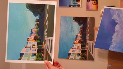
Hi everybody, I'm trying to make some fine art prints of my original paintings.
I had professional high resolution photos taken of my work, and have edited the colors in photoshop (with monitor set to medium brightness... I know that sometimes bright monitors are to blame for color discrepancies). I am printing from photoshop and set the colors to be managed by photoshop, yet in many of my paintings the colors are way too green. And yes, I've also downloaded the correct ICC profiles for the types of paper I'm using.
Is there any setting on the printer to help with this? Help!
- Mark as New
- Bookmark
- Subscribe
- Mute
- Subscribe to RSS Feed
- Permalink
- Report Inappropriate Content
03-29-2018 01:34 PM
How my settings changed is still a mystry to me. However, changing from printer management to Photoshop Elements management, saved me a lot of headaches. Thanks.
- Mark as New
- Bookmark
- Subscribe
- Mute
- Subscribe to RSS Feed
- Permalink
- Report Inappropriate Content
08-06-2018 12:26 PM
Hello everyone. New member here. I know I'm responding to an 6 month old post but I have the same green print issues with my new Canon Pixma Pro-100 and have a few comments.
First of all I'm almost certain the color cast has nothing to do with the printer since my Epson 2880 did the same thing before I decided to replace it. I have printed from Lighroom CC, Photoshop CC, iPhoto, Preview and Print stiudio Pro. They all produce the same results.
I printed the pattern print as suggested and can improve the print to a certain degree by making the recommended adjustments but it just seem like a bandaid fix to me.
How do I know that the image I send a client or to a pro printer (ie. MIllers or Bay Photo) is the correct color and luminence? I think for everything to work properly the printer has to be able to produce photos that are at a minimum a close resemlance to what you see on your monitor. I know the monitor is projecting light and the print is reflecting light so they will never look exactly the same but they should be at least close without much tweaking.
BTW: I use a Spyder5 colorometer with Spyder5Elite software for monitor calibration;
iMac (Retina 5K, 27-inch, 2017)
Your thoughts?
- Mark as New
- Bookmark
- Subscribe
- Mute
- Subscribe to RSS Feed
- Permalink
- Report Inappropriate Content
08-06-2018 12:48 PM
If you’re having a problem with two printer types my recommendation would be to sort out your color management problem first.
Download this test image, open it in your photo software, make no adjustments and print it. I’ve done it with many printers and computers helping people and you should get an excellent print. If the print doesn’t look good on its own (don’t compare to monitor) then you need to work on printer settings - correct ICC profiles and media type.
http://www.outbackphoto.com/printinginsights/pi049/essay.html
Then work on getting monitor to look like print.
Conway, NH
R6 Mark III, M200 (converted to infrared), RF lenses, Pixma PRO-100, Pixma TR8620a, Lr Classic
- Mark as New
- Bookmark
- Subscribe
- Mute
- Subscribe to RSS Feed
- Permalink
- Report Inappropriate Content
08-10-2018 03:39 AM
I am also facing color problems while printing on a cardstock paper. After doing my research online I came across that Pixma pro 100 is a good printer for cardstock as mentioned by many sites like this one. The printing job is fine but the colors are different from the real images. Any help would be highly appreciated.
- Mark as New
- Bookmark
- Subscribe
- Mute
- Subscribe to RSS Feed
- Permalink
- Report Inappropriate Content
08-10-2018 07:21 AM - edited 08-10-2018 08:28 AM
Good morning vander.
How different are the colors? Is your monitor color profiled? What media type are you choosing?
Download load and print this test image without making any adjustments.
http://www.outbackphoto.com/printinginsights/pi049/essay.html
Conway, NH
R6 Mark III, M200 (converted to infrared), RF lenses, Pixma PRO-100, Pixma TR8620a, Lr Classic
- Mark as New
- Bookmark
- Subscribe
- Mute
- Subscribe to RSS Feed
- Permalink
- Report Inappropriate Content
08-10-2018 07:22 AM
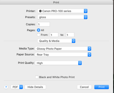
Thanks John. I've tried all of your suggestions and have also been communicating with Canon and have not been able to solve the issue other than fudging in Print Studio Pro. And even then I'm not satisified with the results. The problem is most likely a sofware issue. Maybe it's the Canon driver which will not let you turn off color syc. Very frustating.
- Mark as New
- Bookmark
- Subscribe
- Mute
- Subscribe to RSS Feed
- Permalink
- Report Inappropriate Content
08-10-2018 07:38 AM
Good morning dlanier.
I'm guessing the Outback test print didn’t print well then? I'm guessing Canon support asked all the right questions, but:
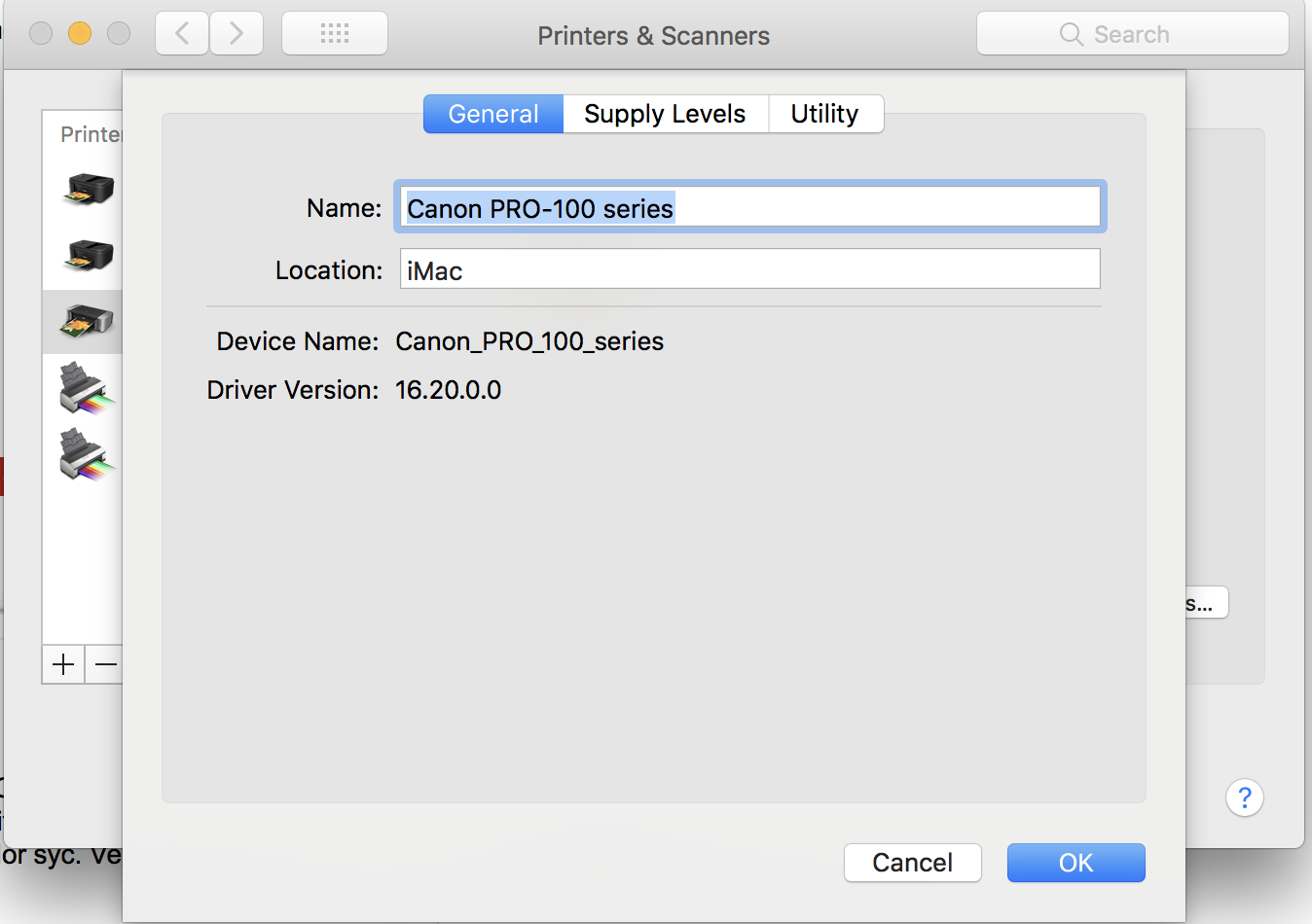
1. You have the Canon IJ series driver and not the Bonjour driver? System Preferences->Printers & Scanners.
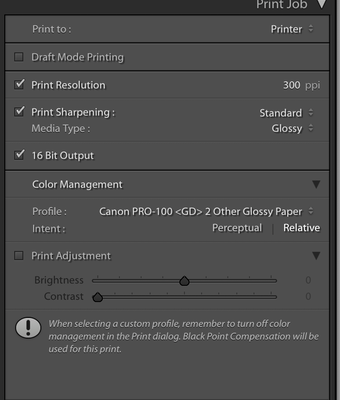
2. The Adobe products you listed should turn off color management automatically. Can you post a screenshot of your print module settings in Lightroom?
Conway, NH
R6 Mark III, M200 (converted to infrared), RF lenses, Pixma PRO-100, Pixma TR8620a, Lr Classic
- Mark as New
- Bookmark
- Subscribe
- Mute
- Subscribe to RSS Feed
- Permalink
- Report Inappropriate Content
08-10-2018 07:53 AM
Hey John,
the test print was not bad but still had some off colors.
not using the bonjour driver.
- Mark as New
- Bookmark
- Subscribe
- Mute
- Subscribe to RSS Feed
- Permalink
- Report Inappropriate Content
08-10-2018 08:27 AM - edited 08-10-2018 08:31 AM
What paper are you using? I'm guessing its not a Canon paper and one that doesn't come with its own ICC profile?
When you say the test print had off colors you mean in the print, not compared to screen?
Conway, NH
R6 Mark III, M200 (converted to infrared), RF lenses, Pixma PRO-100, Pixma TR8620a, Lr Classic
- Mark as New
- Bookmark
- Subscribe
- Mute
- Subscribe to RSS Feed
- Permalink
- Report Inappropriate Content
08-10-2018 08:53 AM
I am using Canon paper (gloss) but I've also tried Inkpress and HP papers with the same results. Inkpress says to use the Canon profiles. For the HP pape I did not have an ICC profile so I used the gloss profiles that came with the printer..
I thought the grays in the test print looked a little green. But compared to my monitor there were seveal colors that were off.
03/17/2026: New firmware updates are available.
SELPHY CP1500 - Version 1.0.7.0
02/23/2026: New firmware update is available for EOS C50- Version 1.0.3.1
01/23/2026: New firmware update is available for RF 24-105mm F4 IS USM- Version 2.0.7
01/20/2026: New firmware updates are available.
12/22/2025: New firmware update is available for EOS R6 Mark III- Version 1.0.2
11/20/2025: New firmware updates are available.
EOS R5 Mark II - Version 1.2.0
PowerShot G7 X Mark III - Version 1.4.0
PowerShot SX740 HS - Version 1.0.2
10/21/2025: Service Notice: To Users of the Compact Digital Camera PowerShot V1
10/15/2025: New firmware updates are available.
Speedlite EL-5 - Version 1.2.0
Speedlite EL-1 - Version 1.1.0
Speedlite Transmitter ST-E10 - Version 1.2.0
07/28/2025: Notice of Free Repair Service for the Mirrorless Camera EOS R50 (Black)
7/17/2025: New firmware updates are available.
05/21/2025: New firmware update available for EOS C500 Mark II - Version 1.1.5.1
- PIXMA TR150 series-AirPrint won't print color in Mobile & Compact Printers
- imageCLASS MF455dw - unreachable jam in Office Printers
- imagePROGRAF iPF6100 Printed colors don't match monitor after calibration in Production Printing
- MF665Cdw will not color correct in Office Printers
- PIXMA G3260 printing a black and white photo in green in Desktop Inkjet Printers
Canon U.S.A Inc. All Rights Reserved. Reproduction in whole or part without permission is prohibited.


